
Support / Using Pilea
Reading the priority breakdown for a backlog item
Every priority score in Pilea is transparent. You can see exactly which customer signals are driving each backlog item’s score and how much each signal contributes. This helps you understand why an item ranks where it does and whether the data matches your intuition.
You can view the breakdown in two ways: a quick tooltip by hovering, or a full breakdown in the item’s detail panel.
Viewing the breakdown tooltip
The fastest way to check what’s driving a score is to hover over it.
- Open your Backlog in list, table, or kanban view.
- Hover over the priority score bar next to any item.
- The breakdown tooltip appears, showing a histogram of signal contributions.
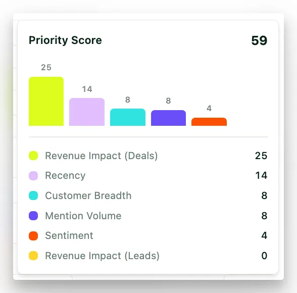
Screenshot: Backlog list view with the hover tooltip visible on a priority score bar, showing signal histogram.
Each bar in the histogram represents one of the six input signals. Taller bars mean a higher contribution to the total score. The bars are sorted by impact, so the signal driving the score most appears first. The number above each bar is the points that signal adds to the score.
If the effort divisor is on, the tooltip notes which divisor was applied. If the item has no linked mentions yet, it says “No signal data yet” instead of a chart.
Viewing the full breakdown in the detail panel
For a more detailed view with the option to override the score:
- Click any backlog item to open its detail panel.
- In the Details tab, scroll to Priority Score.
- The full breakdown shows each signal with its bar and the number of points it contributes to the score.
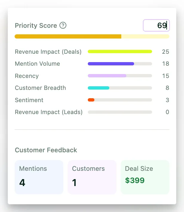
Screenshot: Backlog item detail panel showing the Priority Score section with the full signal breakdown and override option.
The detail panel breakdown includes the same information as the tooltip, plus the option to manually override the score. Click the ? next to Priority Score to see a short explainer of the active framework, what each signal measures, and the weight it carries in your workspace. It links straight to the scoring settings.
💡 Tip: Use the detail panel breakdown when you’re triaging items or preparing for a prioritization meeting. The per-signal points make it easier to explain to your team why an item ranks where it does.
Mentions over time
Above the item’s description, the detail panel shows Mentions over time - a bar chart of how many times the item was mentioned each week. It appears once an item has more than one mention and starts on the most recent 26 weeks. Use the arrows to page back, or All to see the full range.
Read it next to the breakdown. A high Recency signal with a rising chart is a request that’s growing. A high score carried by Revenue Impact with a flat, old chart is a big customer who asked once. Both can be right to build, but they’re different decisions.
Previous and next arrows in the top corner of the panel (or the left and right arrow keys) step through items in the order you’re looking at, so you can compare breakdowns without closing the panel.
What each signal means
The breakdown shows six signals. Here’s a quick reference for what each one measures:
| Signal | What it measures |
|---|---|
| Revenue Impact (Deals) | Total deal size of existing customers (status: Customer) who mentioned this item |
| Customer Breadth | How many distinct customers mentioned this item |
| Mention Volume | Total number of mentions, scaled so repeat complaints from one customer don’t overwhelm the score (one customer filing 50 tickets won’t outweigh three independent reports) |
| Recency | How recently customers mentioned this item (exponential decay, 30-day half-life by default - configurable in the scoring settings) |
| Revenue Impact (Leads) | Total deal size of prospects (status: Lead) who mentioned this item |
| Sentiment | Average sentiment of mentions - negative sentiment scores higher because frustrated customers are at higher churn risk |
An item doesn’t compete against a global benchmark - it’s ranked against other backlog items in your workspace. Archived mentions don’t count towards any signal.
ℹ️ Note: How much each signal can contribute depends on the weights set for your workspace. If your workspace uses the WSJF-based framework, the breakdown shows its three components (User/Business Value, Time Criticality, Risk Reduction) instead. See Setting up your prioritization framework for details.
Understanding zero-value signals
A signal showing zero doesn’t mean something is broken - it means there’s no data for that signal on this item yet.
| Signal shows zero | What it means | What to do |
|---|---|---|
| Revenue Impact (Deals) | No companies with the status Customer and a known deal size have mentioned this item | Connect your CRM in Integrations (under Data Sources in the sidebar), or set deal sizes and statuses on the Companies page |
| Revenue Impact (Leads) | No companies with the status Lead and a known deal size have mentioned this item | Connect your CRM to import prospect deal values, or set them on the Companies page |
| Customer Breadth | Only one customer (or none) has mentioned this item | As more feedback comes in, breadth increases naturally |
| Mention Volume | Very few mentions exist for this item | Import more feedback or wait for integrations to sync new data |
| Recency | All mentions are older than the decay window | Fresh mentions will increase this signal. With the default 30-day half-life, older signals fade quickly - raise the half-life in the scoring settings if that’s too aggressive for your team |
| Sentiment | The mentions didn’t have clear positive or negative sentiment | This is normal for neutral or factual feedback |
Zero-value signals are common for new items or items with limited feedback. Priority scores improve as you connect more data sources and collect more feedback. See Customer profiles and deal sizes for how statuses and deal sizes feed the revenue signals.
Recognizing a pinned (overridden) score
When someone on your team has manually overridden a backlog item’s priority score, you’ll see a pinned badge next to the score in the detail panel and the hover tooltip, and a small P badge next to the score in the list, table and kanban views.
A pinned score means:
- The number you see is a manual override, not the computed score.
- The original computed score is preserved and shown as “Computed: X - manually overridden” in the detail panel and the tooltip.
- The override was set by a team member with an Editor, Admin or Owner role.
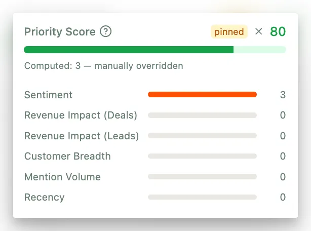
SCREENSHOT: Backlog item showing a pinned score badge with the “Computed: X - manually overridden” label visible in the detail panel.
To remove an override, open the item’s detail panel and click the X next to the pinned badge under Priority Score. Only Editors, Admins and Owners can set or remove overrides; Viewers cannot.
⚠️ Important: When scores are recalculated (after new feedback, CRM syncs, or a batch recalculation), pinned scores stay. The computed score updates silently in the background, but the pinned value remains until someone removes it.
Using the breakdown in practice
The breakdown is most useful when you need to answer questions like:
- “Why does this item rank so high?” - Check which signals are driving the score. If Revenue Impact dominates, it means high-value customers are raising this issue.
- “Why does this item rank so low?” - Look for zero-value signals. An item with no revenue data and only one customer mention will score low even if the feedback is urgent.
- “Is this growing or fading?” - Check the mentions-over-time chart. Recency tells you when it was last raised; the chart tells you the trend.
- “Should I override this score?” - If the breakdown shows the data is accurate but you have context the AI doesn’t (an executive commitment, a contractual deadline), an override makes sense. If the breakdown shows missing data, consider connecting more sources first.
- “How do I explain this to my team?” - The per-signal breakdown in the detail panel gives you a clear, data-backed explanation for any prioritization decision.
Stuck? Email us — a human answers, usually the same day.